


Bright colours, jagged bits and the five rings. It looks bloody awful, still its the sort of thing that consultants waste trillions of pounds of taxpayers money on.
They could not even work in the colours of the Union flag(or any other flag from the UK), in short typical of Blair's "Cool Brittania" view of the UK.
The emblem will be available in four colours – pink, blue, green and orange.
Joy, deep joy. We are going to be so sick of that by 2012. Thats twelve minutes past eight not the year by the way. So if you hate the design then don't just moan about it, sign the petition: petition to change the dire design.
It doesn't look like 2012 , which it is supposed to be based on - Now for the New Labour wankspeak from Olympics Minister Tessa Jowell said: "This is an iconic brand that sums up what London 2012 is all about - an inclusive, welcoming and diverse Games that involves the whole country."It takes our values to the world beyond our shores, acting both as an invitation and an inspiration."This is not just a marketing logo, but a symbol that will become familiar, instantly recognisable and associated with our Games in so many ways during the next five years."
Wankspeak 2: When people see the new brand, we want them to be inspired to make a positive change in their life - Tony Blair.
Wankspeak 3:"The new Olympic brand draws on what London has become - the world's most forward-looking and international city. - Ken Livingstone.
Wankspeak 4: International Olympic Committee President Jacques Rogge said: "This is a truly innovative brand logo that graphically captures the essence of the London 2012 Olympic Games - namely to inspire young people around the world through sport and the Olympic values.
Olympics
London 2012
2012 Logo
Dire Rubbish
Oral Sex
Lisa Simpson
I'm sure Margaret Thatcher, had she still been Prime Minister would have immediately covered it over with her handkerchief, as she did with the British Airways logo some years back.
And of course a parody from: http://theospark.blogspot.com/2007/06/london-olympics-logo.html
(Think Lisa Simpson giving a blow job.)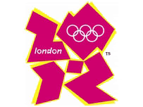
And here is my humble suggestion for an alternative(below).

and another got parody can be found here: http://www.order-order.com/2007/06/subliminal-effectiveness-of-olympic.html
also I found this one amusing:http://www.boingboing.net/2007/06/04/london_2012_olympic_.html
5 people have spoken:
Your logo is far far better...
2 mins in microsoft paint, so I reckon the government can pay me £400,000 an replace that jigsaw puzzle design.
The one the government came up with looks more like a logo for the Gay Olympics. Wait until you see the team sports...
Would rather pass on the team sports, will leave that for certain Lib Dem MP's.
it does it like lisa simpson
Post a Comment